Tuesday, November 29, 2016

Assignment 10- Arc Collector Part Two: Litter

Introduction


In the second assignment of using Arc Collector, each student created their own projects.  This project focuses on litter in the Eau Claire area.  The main question of this research to see where most of the litter in the study area lies.  There were four zones where data was collected, housing, bars, park, and campus.  The data will hopefully show where more trash cans need to be put in in order to decrease the amount of litter on the ground in Eau Claire.  Data was collected using Arc Collector and then edited in ArcGIS Online as well as ArcMap on a desktop.  For this project, it was very important to have a proper project design in order to produce accurate results.  A set research question was asked and feature classes were created with attributes that made sense to collect.  This in turn produced a successful project.

Study Area


The original study area was set before any data was collected.  This area ended up being too big when data was being collected.  A smaller study area was created based on the points collected.  The original and final study areas can be seen in Figure 1 and 2.  This data was collected between November 17th to the 21st.  The weather throughout these days was quite cold with temperatures ranging from 30-45 degrees (F).

Figure 1: The original study area for this project.
Figure 2: The final study area for this project based upon the data collected.

Methods


Before going out into the field, the feature classes had to be set up.  These classes were area, amount, garbage, description, and notes.  Figure 3 below displays all of these fields.  Domains were set for area, amount, and garbage.  The areas were housing, campus, park, and bars.  Amount was 1, 2-5, 6-10, 11-20, 21-30, and >31.  Garbage meant whether there was a garbage around.  The attributes for this were next to garbage can, within walking distance, visible but far away, and none in sight.  Description did not have a domain because it was used to describe what kind of litter was found.  For example, plastic bag, beer cans, cigarette butts, etc.

Figure 3: The fields and their attributes used in collecting litter data.
After the fields were all set up, they were imported into ArcGIS online.  This allowed the class to download their individual maps onto their phones or what ever they were collecting data with.  From there, each student was reading go and collect data.  Below in Figures 4 and 5 are screenshots of what the collector app looks on the phone used (Samsung Galaxy S6).  

Figure 4: A screenshot of the Arc Collector app interface when collecting data.
Figure 5: The interface in Arc Collector when entering a point.
 The data points were collected over a few days.  The points were taken while walking down the sidewalk.  Most of the litter was either on the sidewalk or in yards by the sidewalk.  This means that the points aren't in the exactly precise spot where the litter was found, however it is very close.  When it came to a point that represented more than one piece of litter it means that it was obvious when standing in one spot that there were multiple pieces of litter together.  If the pieces were separated by some distance than separate points were logged.  In total, 69 points were collected.

Results


The results of this assignment are shown below in Figure 6.  Figure 6 displays the amount of litter at each point that was collected.  It can be seen that there is a lot of litter within the housing and bar areas.  There is less on campus and in parks.  The greater amount of litter in housing and bars could be attributed to a lot of different causes.  For example, intoxicated people throwing empty cans and bottles on the ground, bar patrons throwing cigarette butts on the ground, the people living in these areas only pay rent rather than owning so they don't care about the status of litter in their yard.  There are many reasons.  There could be less litter in parks and campus because of the higher number of trash cans available, workers who are paid to clean up these areas, people don't see litter on the ground so they don't litter, etc...  The causes for the greater or lesser amount of litter in these areas can be attributed to many different reasons.  

Figure 6: The amount of litter at each data point that was collected within the study area.

Figure 7 shows the points where litter was collected in proximity to where a garbage is located.  This map is only partially accurate.  The garbage cans in the park area, bar area, and on campus were actual garbage cans that were meant to stay there.  The garbage cans in the housing area were garbage cans that belonged to the houses.  After looking over the data, it makes sense to exclude these individuals garbage cans.  On one of the data collecting days was trash day so this skewed the data in the housing area as well.  Ignoring the green points in the housing area it is obvious that there is no permanent garbage cans for residents to throw away their litter.  This could be because people would dump their trash in the available bins rather than paying for a trash service.   In the other the areas, there were more trash cans readily available, but the amount of litter varied.  In the bar areas, the most litter on the ground was typically cigarette butts.  People typically stand outside bars and smoke and throw their cigarette butts on the ground.  If bars provided ashtrays maybe the amount of cigarette butts on the ground would reduce.  As for the litter on campus, most of the litter is right by a trash can or within walking distance.  It was found that there was minimal litter on campus, except for right by the trash cans.  The litter typically on the ground is gum and small pieces of paper.  Perhaps people miss the bin when throwing away their litter or those who empty the bins spill some when emptying them.  There are many causes for the litter on the ground along with many solutions to avoid more litter on the ground.

Figure 7: The data points collected displaying the proximity of litter to garbage cans.
A web map was also created for this project that was created on ArcGIS online.  That map is shown below.  It displays the same map as in Figure 6.


Conclusions


This assignment was incredibly useful for future use of data collecting.  It required the class to set up feature classes all with their own attributes.  It was very important to set this all up correctly or the whole assignment wouldn't have worked.  The project proved that there is more litter in the bar and housing areas than in park and on campus.  More trash cans could be put in in bar and housing areas, however even these may not help.  Other solutions to cleaning up the litter within these areas is to encourage the residents to pick up litter in their yards and clean up after themselves.  If this project were to be done again, the only thing that would be changed would be to create points for garbage cans.  This would be useful to see them in proximity to where the litter was.  It would also be useful to only mark where permanent trash cans are rather that household trash bins as well.  This project could be expanded into a larger project if someone wanted to do more research on litter in the Eau Claire area and how to clean up these areas.

Tuesday, November 15, 2016

Assignment 9- Arc Collector Part One: Microclimates

Introduction


This assignment focuses around using Arc Collector.  Arc Collector is a program that can be used on smart phones and tablets.  It is used to collect and update data in the field and log location.  It is a progressive way to use everyday technology in the field to collect data.  The class got familiar with the app whether it was on a phone or tablet.  After this, Dr. Hupy explained the attributes each group needed to collect.  These were temperature, dew point, wind speed, wind direction, and group number.  Each group collected around 10 or more points and then returned to class.  From there, each student created maps depicting the data the class collected as a whole.  The purpose of using Arc Collector this week was to prepare the class for the next assignment.  The next assignment will also be using Arc Collector, however, each student will develop a research question and collect their own data.  

Study Area


Campus was divided into five sections for this assignment.  Figure 1 below shows the five different zones.  Two or three groups were put into each zone to collect data.  The data was taken between 3-5 p.m. on November 9, 2016 which was sunny and mid 50's for the temperature.  Our group (Sarah and I) was located in zone 2.  Figure 2 also display the study area and also shows the different data points collected within the zones by each group.  As it can be seen in Figure 2, there were no data points taken in zone 4.  There is also no group 5, which were most likely the ones assigned to zone 4.   These were simple mistakes, which did not alter the data very much.

Figure 1: Study area with the five separate zones.
Figure 2: Data points that were collected and sorted out by group number.


Methods


The group set off to zone 2 to collect data points just after Dr. Hupy explained how to use Arc Collector.  He helped us all to set up our own maps and then explained how to collect a point.  In order to collect a point, you had to click the plus button lower down on the screen of the phone or tablet you're collecting data on.  From there, the attributes will come up and the data can be entered.  Once this is finished, all that had to be done was to click the check button to add the point to the map. The group collected points in many different areas to get varying results.  These points were taken in the sun, shade, between buildings, under vents, and by water.  Arc Collector was relatively easy to use and updated in real time.  This allowed each group to see where others were collecting points.  The wind data was collected using a compass and a simple air data meter.  These two tools helped to find the wind data that was then entered into Arc Collector.

Each group collected their points and then headed back to the lab.  From there, Dr. Hupy instructed the class on how to download the data from ArcGIS online.  It was all quite simple and easy to understand.  Figure 2 below shows that different attributes that groups gathered.  The attributes highlighted in blue were from our group.

Figure 3: Attributes collected from the different groups.

Results


The data for this assignment was interesting to work with.  Below, two maps are depicting temperature and wind direction within the study area.  Figure 4 displays temperature on campus.  The temperature was created using the IDW interpolation tool in ArcMap.  Other interpolation methods were tried out, however IDW looked the most accurate.  The cooler areas on campus mostly lie within heavily wooded areas or by water of some sort.  The hotter areas are located around large buildings on campus which pump out hot air.  If more points were taken, this map could show even more accurate temperature patterns within the UWEC campus.  There were no points for zone 4, so even though it is a small area, the temperatures here are only estimations.

Figure 4: Temperature patterns on the UWEC campus.
Figure 5 displays the wind direction on campus.  This was done through measuring wind direction in the field using degrees.  The arrows are pointed in the direction that the wind was coming from.  Zone 4, once again, did not have any data collected for it so there is no information in the area.  In the other zones, the arrows create small patterns that can be seen.  It looks like in zone 3 the wind was blowing mostly East.  Above in zone 2 it looks to be blowing more Northeast.  It then shifts North in zone 1 after coming over the Chippewa river.  It's easier to find patterns in the study area as a whole rather than just focusing on one zone.


Conclusion


This lab demonstrated the basics of how to use Arc Collector.  This was then used in the field to collect data on the wind and temperature.  Collector produced satisfying results and achieved the main purpose of the lab, which was to collect data using the technology available to most people today; our cell phones and tablets.  This was good practice for the next assignment which is very similar to this one.

Tuesday, November 8, 2016

Assignment 8- Navigation with a Map and Compass

Introduction


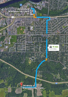
For this assignment, the class headed out to the Priory.  The Priory is a University owned area about 3.4 miles from the main campus.  Figure 1 below shows the route from campus to the Priory.

Figure 1: Directions to the study area (Google Maps).
The class met in the parking lot and discussed the activity.  Each group was given five points within the woods behind the Priory.  The groups were also given printed out maps, which were made by one of the group members that were made for last weeks assignment.  The groups also received a GPS and a compass.  Dr. Hupy gave some instructions and set the class free.  Each group was supposed to navigate to the five points they received.  The navigation tools were limited and each person had a specific job to do while in the woods.  The activity took less than two hours to complete.

Study Area


Figure 2 below shows the study area inside the dark blue square.  The points were spread out within this area.
Figure 2: Study area of the Priory.

Methods


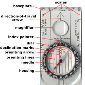
Before the groups dispersed, Dr. Hupy instructed the class on how to use the compass and paper map.  He said to line the edge of the compass along the line being used to navigate.  Then, adjust the dial so the arrow aligns with the orienting arrow.  The person holding the compass was then supposed to hold it flat against their chest and follow it while keeping the needle in the orienting arrow.  Figure 3 is the GPS the group used to verify the points and Figure 4 shows a compass similar to the one the class used.  
Figure 3: The GPS used to verify the given coordinates.
Figure 4: A similar compass to what the class used.
Before heading out into the woods, the group found the five points on the map and marked them in order to navigate better.  Figure 5 shows the five points marked for group 3.  Figure 6 displays the five points coordinates that the group attempted to navigate to.  The five points were really spread out which made the assignment a bit more difficult.

Figure 5: The five points marked for navigation.
Figure 6: The five coordinates.


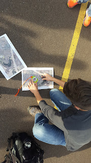
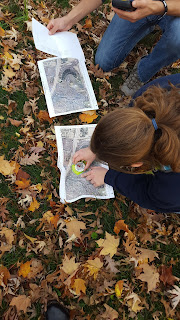
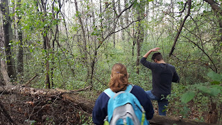
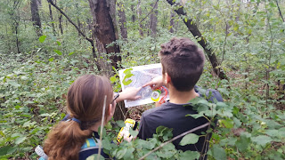
 Navigating with the compass took to time to get used to.  The group figured out easily how to use the compass, but using it while hiking through the woods made things complicated.  The terrain in the woods was rougher than expected and it was tough to walk in a straight line and keep the needle of the compass in the orienting arrow.  The group had to stop many times within the woods in order to adjust the compass and ensure we were headed in the correct direction.  Figure 7 and 8 shows group members Andrew and Heather using the compass to set up which direction the group should go.  Like it was stated before, the terrain was difficult to navigate through.  There were a lot of leaves on the ground, fallen trees, and many twigs that kept hitting all of us in the face. Figure 9, 10, and 11 display some of the terrain that the group came across.
Figure 7: Andrew using the compass to figure
out how to navigate towards the first point.
Figure 8: Heather using the compass to navigate
towards one of the given points.

Figure 9: The terrain the group encountered.
Figure 10: Andrew and Heather dictating which direction to head next while in the woods.
Figure 11: Andrew at the bottom of the ravine where one of the points was thought to be.

Discussion


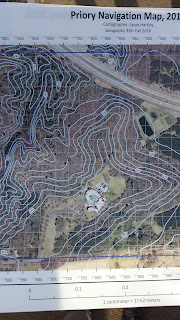
Throughout this process there were some errors and mistakes made.  The first is shown in Figure 12.  The maps the group used were my own and the legend said the contour intervals were 5 feet when it was actually supposed to say meters.  This didn't produce any complications the field.  The other mistakes made were thinking certain were our own when they weren't.  The group came across many trees marked by pink tape (Figure 13, indicators of the points we were searching for) which were debated over whether they were ours or not.  When looking at the maps it seemed as though the group was in the right area, however the GPS said otherwise.

Figure 12: Map mistake.
Figure 13: One of the markers the group
came across in the woods.


Results


Below in Figure 14 shows the group's tracking points which were taken by the GPS.  Figure 15 shows a line of these tracks along with direction.  The tracks show the the group got close to the points, but sometimes not to the actual point.  There was pink tape on some trees in that area that seemed like the right point, but the GPS points were off.  The group got to the areas which seemed close enough.  We couldn't decide if the GPS was off, we were off, or the tape had fallen off the trees and we couldn't find the right spot.
Figure 14: GPS tracking points in the woods.


Figure 15: GPS tracking points with direction to the given points.

 Conclusion


This activity was very educational, frustrating, and fun.  It is very useful to know all of these navigation skills, especially when technology fails.  Navigation without technology is difficult, but possible with some practice.

Tuesday, November 1, 2016

Assignment 7- Development of a Field Navigation Map

Introduction


For this assignment, two maps needed to be created in order to complete a navigation activity in the next lab.  When navigating, one needs two sets of tools.  The first being the tools to complete the actual navigation, which cover the simple to the advanced, like the sun, a map, GPS, etc.  The second thing being some type of location system, like a coordinate system.  These systems are based on latitude and longitude, which isn't always the best method to use.  On a smaller scale, it is better to use a state plane or UTM system.  The two maps created for this assignment are using UTM and Geographic Coordinate System of Decimal Degrees.

Study Area


The maps that were created for this assignment are of the Priory, which is a University owned area with a dorm and children's nature preserve.  The area is about 3.4 miles away from the UW- Eau Claire campus. Figure 1 below shows the directions from campus to the priory.  Figure 2 shows that actual Priory study area.

Figure 1: Diretions to the study area (Google Maps).
Figure 2: Study area at the priory (Google Maps).

Methods


For these maps, a different coordinate system was used for each.  For the first map, the coordinate system is NAD 1983 UTM Zone 15N.  This is a common coordinate system which is catered to certain zones to produce an accurate representation of the land.  Figure 3 below shows the zones in the lower 48 states of the U.S.  The state of Wisconsin is broken up into zones 15 and 16.  The whole system is broken in 60 zones which are each 6 degrees of longitude wide.  The zones are also split into north and south at the equator.

Figure 3: UTM zones in the U.S. (http://i.stack.imgur.com/OD3g3.jpg)
For the second map, Geographic Coordinate System WGS 1984 was used.  This distorts the maps when it is used in a smaller scale like this assignment.  This coordinate system uses latitude and longitude to determine locations.  The location is stated in decimal degrees, but this can cause issues.  Decimal degrees are not good to use when measuring distance because it isn't truly a form of measurement.  Figure 4 displays how GCS is measured.

Figure 4: GCS system (http://help.arcgis.com/en/geodatabase/10.0/sdk/arcsde/images/coordsys01.jpg)
The final map for the UTM zones is shown below in Figure 5.  This map is overlayed with a grid which displays the critical number and the beginning number.  The contour layers used in this map have a 5 meter spacing to indicate changes in elevation.  This will help with navigation in the following assignment.  Because this map is a projected coordinate system, it means that it has a projection which is a transverse mercator.  The GCS map not have a projection because it is unprojected which is causing the distortion in the image.  The GCS map has the same contour intervals but are distorted along with the image.  The UTM map will most likely be more useful in the field when it comes to navigating.  However, the GCS map will most likely be used for navigation or something else as well.

Figure 5: UTM navigation map of the Priory.

Figure 6: GCS navigation map of the Priory.
Another aspect of this assignment was pace counting, which was not done.  This was due to bad weather the previous week.  Pace counting helps to determine how far you're going when navigating with a paper map.  Pace count is done by walking 100 meters and measuring the number of paces it takes to get to this distance.

Discussion


 This activity was very informative.  It was all rather new and should produce interesting results in the field, especially navigating with paper maps.  The maps should hopefully prove useful in the field.  Some aspects of the map may be off in some sort and may throw some things off when navigating, but these confusions or downfalls of the maps will be discussed in the following lab.  the two maps that were created for this assignment are similar in many ways while also being completely different.  Changing a coordinate system can create large changes, especially when the coordinate system is either projected or unprojected.  I would have been useful to measure out a pace count beforehand, but this can be done tomorrow during the lab.

Conclusion


These maps were challenging to create in some ways, but have provided a new insight into simple navigation.  Working with classmates and looking at previous blogs has helped to further knowledge on this subject.  However, actually working in the field and learning from personal mistakes will most likely create the greatest amount of learning.  There will most likely be changes that will be needed to make to the maps, bu this will be discussed in the following blog.