Tuesday, October 25, 2016

Assignment 6- Conducting a Distance Azimuth Survey

Introduction


In this assignment, the class was required to conduct a survey.  This was done behind Phillips hall along Putnam Drive.  From there, the class broke up into three groups. There would have been more groups, but there was limited equipment. The class was supposed to collect 30 tree locations along with their species, diameter, azimuth, and distance.  This is a simple way to do a survey of a small area when other more advanced technology fails.  This is not ideal, but it can work for small study areas.  The three different groups were given a GPS point for the certain area they were supposed to stand and gather the points.  From there, the person standing in this spot measured the azimuth and distance of a tree from where they were standing using survey instruments.  10 points were collected from each of the three groups to produce 30 different tree locations and their attributes.

Study Area


Below, Figure 1 gives an idea of where the data points were collected from.  The red square box is where Phillips hall is.  Further back on Putnam Drive shows the three different data collection points.  These point were spread out enough where there would be no overlapping data points collected.

Figure 1: Phillips hall and the three data collection points.

Methods


For each tree, latitude and longitude, distance, azimuth, diameter, tree type and group number were recorded.  The lat and long were only three different spots which were where the tree data points were collected.  The person standing there then measured the distance and azimuth from their spot to a tree.  This was manually recorded.  Someone else in the group would then go to the tree and measure it's diameter.  Finally, the group had to debate the species of tree and record this.  Below in Figure 2 shows the excel sheet with the data that was collected from each group. 

Figure 2: Excel spreadsheet displaying the data collection is assignment 6.
These attributes were chosen to collect because they were deemed the most important.  The attributes give a unique description for each data point that was collected.  This is crucial in order to create a unique identifier in a map later for each tree. 


Discussion


This assignment was less technological and advanced that most other assignments.  These data collection methods are supposed to be used in circumstances where technology fails.  There was minimal technology used in the lab, which made it less advanced.  Less advanced does not mean lesser work, though.  The data that was collected was for the most part was accurate and reliable, as long as the person collecting the data points stayed in the same location.  The person collecting data points kept changing so the collection point changed just slightly which may skew data points a bit, but not in a major way.  This was the only problem that was was encountered during this assignment, though many issues could have come up if the groups were not careful.

Conclusion


This assignment was successful overall.  It helped to have three different groups so everyone could work with different people while collecting data points.  There were very minimal problems encountered while doing this assignment.  Perhaps, if more data points were collected with more attributes then most errors could have been made.  However, very few mistake were made.  It was good to work in groups and work through how the equipment was used with each other.  This assignment was very informative and it would be useful to use the field method techniques in another lab.

Tuesday, October 18, 2016

Assignment 5- Visualizing and Refining Terrain Data

Introduction


This assignment required the data from the previous sandbox assignment.  In the previous assignment, each group was to create a landscape in a sandbox.  The sandbox was 114 cm on each side and it was divided into 6 cm boxes to create a grid across the sandbox.  Below in Figure 1 is a picture showing the grid.
Figure 1: The grid overlaying the sandbox for this assignment.
Each square was measured, recorded, and then input into an excel file.  It was realized later that a measurement for each square was not needed.  This is because sampling wasn't taken into consideration.  Systematic sampling was used in a way.  This type of sampling is organized distribution of measurements, which means not having to measure each square.  This was sort of done in the previous assignment.  There were some squares where it was obvious they would have the same measurements as the previous squares.  Otherwise, each square was measured, which ended up creating very precise results.  There is nothing wrong with very precise results especially considering that it's a small area of study.  However, that degree of preciseness just wasn't always needed.

When the measurements for the previous lab were being input into an excel file, data normalization had to be taken into consideration.  Data normalization is important when inputting data.  It is the process of organizing columns and tables of database in order to improve data integrity.  If the measurements were input wrong into the excel file, that could make the results turn out completely different.  Luckily, the results turned out correct the first time and the measurements taken were accurate.

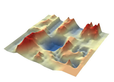
In this lab, the measurements were input into ArcMap and a point feature class was created.  From there, interpolation methods were used to create the digital elevation model (DEM) of the sandbox.  There are multiple different interpolation methods that produce different looking results.  Each were tried out until it was decided which method was most accurate to display the sandbox data.

Methods


1. IDW

  • IDW (Inverse Distance Weighting) was the first interpolation method that was tried out.  This method uses weighted distance, which means the average needs to be between the highest and lowest numbers.  This method estimates values by averaging the values in the same area of each processing cell.  When a point is closer to the center of an estimated cell, it will have a greater influence on it's appearance.  This means IDW cannot create ridges or valleys if they have not been measured thoroughly.  This method relies on sampling that is distributed evenly in order to produce accurate results.  Below in Figure 2 the sandbox data is being displayed using IDW interpolation. This method looks a bit too precise.  Perhaps if the measurements followed the systematic sampling better rather than taking a measurement for each square, then the resulting image might look more smooth.
Figure 2: IDW interpolation from the side.
2. Kriging

  • This interpolation method is more advanced and intense.  It generates an image from the set of z-values.  This method produces very precise results.  It produces even more precise results when more measurements are taken, like this scenario.  This method creates an output that flows together better than some other choppy looking methods.  Below in Figure 3 the kriging interpolation method can be seen.  This looks a like a very accurate and realistic representation of the sandbox landscape.
Figure 3: Kriging interpolation from the side.
3. Natural Neighbor

  • In this interpolation method, it finds the closest subset of input samples to a point.  It then applies weights to them, which is based on areas to interpolate a value.  This technique will not produce any unrepresented data.  If data is missing it is averaged with the data it has to produce a model that is close enough to the real thing.  This can be seen below in Figure 4.  This method is similar to IDW, but without some many divots.  This method smooths out the data more, producing a better looking result.
Figure 4: Natural Neighbor interpolation from the side.
4. Spline

  • This method estimates values using a mathematical function.  This function minimizes surface curvature, which produces a very smooth looking surface which still is accurately representing the data.  The great number of measurements means the smother the surface of the output.  This can be seen below in Figure 5.  It is of course smoothed out more than the sandbox, but the features seem to be displaying the most accurate representation compared to other interpolation methods.
Figure 5: Spline interpolation from the side.
5. TIN

  • The final interpolation method is a triangular irregular network (TIN).  A TIN is a vector-based digital geographic data.  In this method, it is create by triangulating a set of vertices with vector data.  The vertices are connected through edges to form a network of triangles.  This is seen below in Figure 6.  This method is practically the same as the above methods, but it is just a different form of data (vector vs. raster).  This still produced a very accurate representation of the sandbox landscape.
Figure 6: TIN from the side.


Discussion

After working with all the interpolation methods, it was decided that the spline method (Figure 4) produced the most accurate representation of the landscape.  This method is smooth and the proportions to the actual landscape were accurate rather than too low or too high.  It didn't have weird bumps or unexplainable results.  A runner up was the TIN (Figure 5).  This also displayed a very accurate representation of the sandbox.  however, it just seemed too bumpy.  It wasn't smooth enough to show an accurate output.  If it were smoother it would be just as good, if not better, than spline.  Next was the kriging method (Figure 2).  This type of interpolation produced an interesting result.  It looked like a real life landscape rather than the sandbox.  This did produce an intriguing result, but it just wasn't accurate with the heights and depths.  They are in the correct areas, but the mountains aren't high enough and the valleys aren't low enough.  Natural neighbor (Figure 3)ranked next because it looks similar to the spline method, but the output had odd shapes all over the place.  This result wasn't accurate compared to the actual landscape.  Finally, IDW (Figure 1) was ranked last.  This is because the output turned out to be rather unsatisfying.  It does look like the landscape in some ways, but the measurements for this interpolation method were too accurate for it to display smoothly.

The data that was used for this assignment, which was collected two weeks ago, was very accurate.  This was nice because it produced fantastic results.  The interpolation methods were interesting to work with because they all look so different representing the same thing.  If different sampling methods were used, some interpolation methods may have worked better than the others.  But, overall the results were satisfactory.

Conclusion


This assignment produced great results and was very good experience.  There were some mistakes made, like not precisely following a sampling method.  This didn't necessarily mess up the results, but it would have been easier to take less measurements.  In assignment 1, the landscape was created, a grid was overlayed, each square on the grid was measured and then recorded.  These measurements were input into an excel file.  In assignment 2, the excel file was input into ArcMap which created a point feature class.  From there, interpolation methods were used to produce different looking DEMs.  Ultimately the spline interpolation method was chose as the best method because it displayed the most accurate representation of the sandbox landscape.  This was really good experience when it come to collecting geospatial data.  It helped to work as a team and talk out questions and concerns about the assignment.  A lot of knowledge was gained through these assignments.

Tuesday, October 11, 2016

Assignment 4- Creating a DEM


Introduction


Assignment 4 involves planning, creating, and measuring the beginnings of a Digital Elevation Model (DEM).  In order to do this, students created a landscape within a sandbox.  The sandbox was overlayed with a grid using strings.  Each box that the strings created was measured and recorded in order to create the DEM later.  There are different techniques used to measure these boxes overlaying the landscape, which is called sampling.  There are three main types of sampling.
  • Random
    • This is the least biased method.
    • Can be used with large amounts of data.
    • May lead to poor representation
  • Systematic
    • Samples are evenly distributed and more straight-forward.
    • Can be regularly numbered.
    • This method is biased, can lead to underrepresentation.
  • Stratified
    • Can be used along with the other two methods.
    • Flexible and applicable to many different areas.
    • Proportions of the areas must be accurate in order to work properly.
The main objectives of this lab were to create a landscape, overlay it with a grid, take measurements and input those into an excel sheet.  This sheet will be used in the next assignment in order to create the DEM.

Methods


In this assignment, the systematic sampling method was used.  It was decided that this is the most reliable method and best for this situation.  This is similar to the stratified method, but it was ultimately decided that systematic would work better in this scenario.  In this assignment, each group got to create their own landscape in the sandbox.  The only requirements were to have five specific features which were,

  A. Ridge
  B. Hill
  C. Depression
  D. Valley
  E. Plain

These five landscapes are displayed in Figure 1 below with the corresponding letters.

Figure 1: The five landscapes displayed with corresponding letters.
The materials used for this assignment were the sandbox, sand, our hands, string, thumb tacks, and yard sticks.  The sandbox was measured at 114 cm on each side.  The group decided to divide each side into 6 cm.  Below in Figure 2 the thumb tacks on each side can be easily seen.  6 cm was decided to be the best length because it would create small squares.  Small squares means that the DEM will turn out more accurate because more measurements were taken.  Also in Figure 2 in the left hand corner is where the first measurement was taken.  From there, it followed upwards along the Y axis to take measurements. Once that row was done, the next column upwards along the X axis was measured.  This was followed in the last measurement was taken in the upper right hand corner of the sandbox.

Figure 2: Sandbox with tacks and a partial grid showing the X, Y layout.
Before taking measurements, sea level needed to be decided.  It was decided that the wooden edge of the box was sea level (0).  In order to take down these measurements, a grid was created on a piece of paper with a box on the paper representing a box on the actual grid.  Then, one group member held the yard stick in each box, another member read the yard stick measurement out loud, and the final group member wrote down the measurements on the piece of paper.  This method was chosen after some debate between the group members.  Figure 3 below displays how the grid kept going across more of the sandbox.

Figure 3: The grid overlaying the sandbox.

Results/Discussion


There were a total of 18 squares in each row and column.  19x19 = 361.  Some boxes had to be measured on the left and right side rather than just in the middle, because of greater relief which needed to be measured.  This resulted in 434 total measurements.  Below in Figure 4, the measurements for the sandbox are displayed.  Figure 4 shows which columns are X, Y, and Z.
Figure 4: Measurements in the excel sheet.
The mean, maximum, minimum, and standard deviation were found from these statistics in the Z column.  They are displayed below in Figure 5.  

Figure 5: Values for the measurements in the Z column.
The sampling technique stayed the same during the survey because the group found that it was working quite well.  The only problems that occurred during this assignment were the the group had to split up square into halved in order to make measurements more accurate.  This may be difficult to transfer into a DEM, but these difficulties will be outlined in the next post.

Conclusion


The sampling technique used was systematic which was best for this situation.  It gave an accurate result which will transfer well into a DEM.  Sampling is defined as "a shortcut method for investigating a whole population".  Systematic sampling related to this definition in that it doesn't measure each area equally.  Certain measurements are taken across an equally distributed area and then recorded.  Using sampling in a spatial situation makes thing simpler especially when the area to measure is very large.  Sampling gives a good overall view of an area without having to measure each individual square inch.  The survey performed on the sandbox was adequate and produced accurate results.

Tuesday, October 4, 2016

Assignment 3- Cemetery Mapping

Introduction


The problem in this assignment involves the Hadleyville cemetery in Eleva, Wisconsin.  Located just south of Eau Claire, the cemetery has lost all record of their maps.  This has caused them to start from scratch.  The Geography 336 this semester has gone and collected the necessary data from the cemetery over the past two weeks in order to fix this problem.  Now each student is required to make a map of the cemetery in order for them to have an updated and reliable map.  Each student in the class has created their own map through using ArcMap which allows for attribute data to be attached to each headstone.  This is much better than creating a simple map with just the points of each headstone.  By using GIS, an interactive map is created which allows for easy usage, simple updating methods, and reliability.

In order to gather this data, the class used a survey grade GPS, a UAS, and written data collection methods.  It was planned that the UAS would take a high resolution aerial image of the cemetery because the images available online were of low quality.  Then, the original plan was to collect a data point with the GPS for each name on a headstone, but this method took too long.  It was decided upon to just stick with written data collection methods which worked out much better and quicker.  This data will then be turned into the attributes entered into the GIS map.

Study Area


Below in Figure 1 is the study area.  It is just south of Eau Claire, WI.  The data was collected in the last couple weeks of Summer 2016.  The data was collected in warm and sunny weather.

Figure 1: Hadleyville cemetery location.

Methods


The class used a survey grade GPS and a UAS in order to conduct the survey.  These were both very accurate tools that were used in order to produce a final interactive map for the cemetery.  The GPS has an accuracy of just a few inches and the UAS has a high definition camera which allows it to produce great looking images.  It was important to have accurate tools because this is such a small study area with many of the headstones right next to each other.  It was originally thought that the GPS would collect the data points, but this ended up taking too much time.  Instead, each student went around collecting the data for each headstone with pen and paper.  This goes to show that a purely digital approach is not always the best choice when it comes to collecting data.

Once the data was all collected it was then entered into a shared spreadsheet which was filled in by the students of the class.  Each name in the cemetery was given a unique identifier (ex: "D5") in order to be joined with the points within the map later on.  The fields for the attribute table were agreed upon by the class.  Not every field is filled in for each headstone, but most of them are.  Some of the headstone were too old to read or were missing which made it difficult to have a fully complete and accurate table.  Once all of the data was entered into the shared spreadsheet, each student downloaded the spreadsheet and joined that data with the points they had entered into their own personal maps.  The UAS data had to be combined with the points in order to have the higher resolution image with the final map.  There were many UAS images to choose from and it was possible to change the bands in order to find certain headstones.  It was very useful to have different images readily available.

Results/Discussion


Below in Figure 2 is part of the table used to create the final map.  The full table is quite long, but looking at this one section covers the fields and how they were filled out.

Figure 2: Attribute data used to create the final map.

Also below in Figure 3 is the final map for the Hadleyville cemetery.  It shows which of the headstones a joined or single, where the ground control points (GCPs) are, and where family monuments are.  The data transferred well into the map.  A few fields had to be updated in order to produce the final result, though.  The data collection methods used to produce this map were good ideas, but needed to be more thought out in the long run.  Some of the fields are missing data and creating point for each headstone became difficult by just relying on an aerial image.  Perhaps discussing the data collecting methods beforehand as class and assigning jobs would have produced better results, but overall this assignment was a success.

Figure 3: Hadleyville cemetery final map.

Conclusion


The methods transferred well into a final product for this project.  This mixed formats of data collection were messy and could have been discussed more, but they were overall a success for the first big assignment.  The potential errors within the map are outweighed by the fact that this map is full of information that the cemetery previously had lost.  The errors can be updated until the map is 100% accurate.  This map can be updated in the future and will be very useful for the cemetery.